MyClinic Group
Health
About the project
In this project case study, I will be sharing my experience designing a mobile app for a local medical clinic centre in Melbourne. The goal was to create an app that made it easy for patients to view appointments schedules, locations, and services. Throughout the design process, I focused on creating an intuitive user interface that would enhance the overall user experience and encourage engagement with the brand new app.
\\ PROBLEM
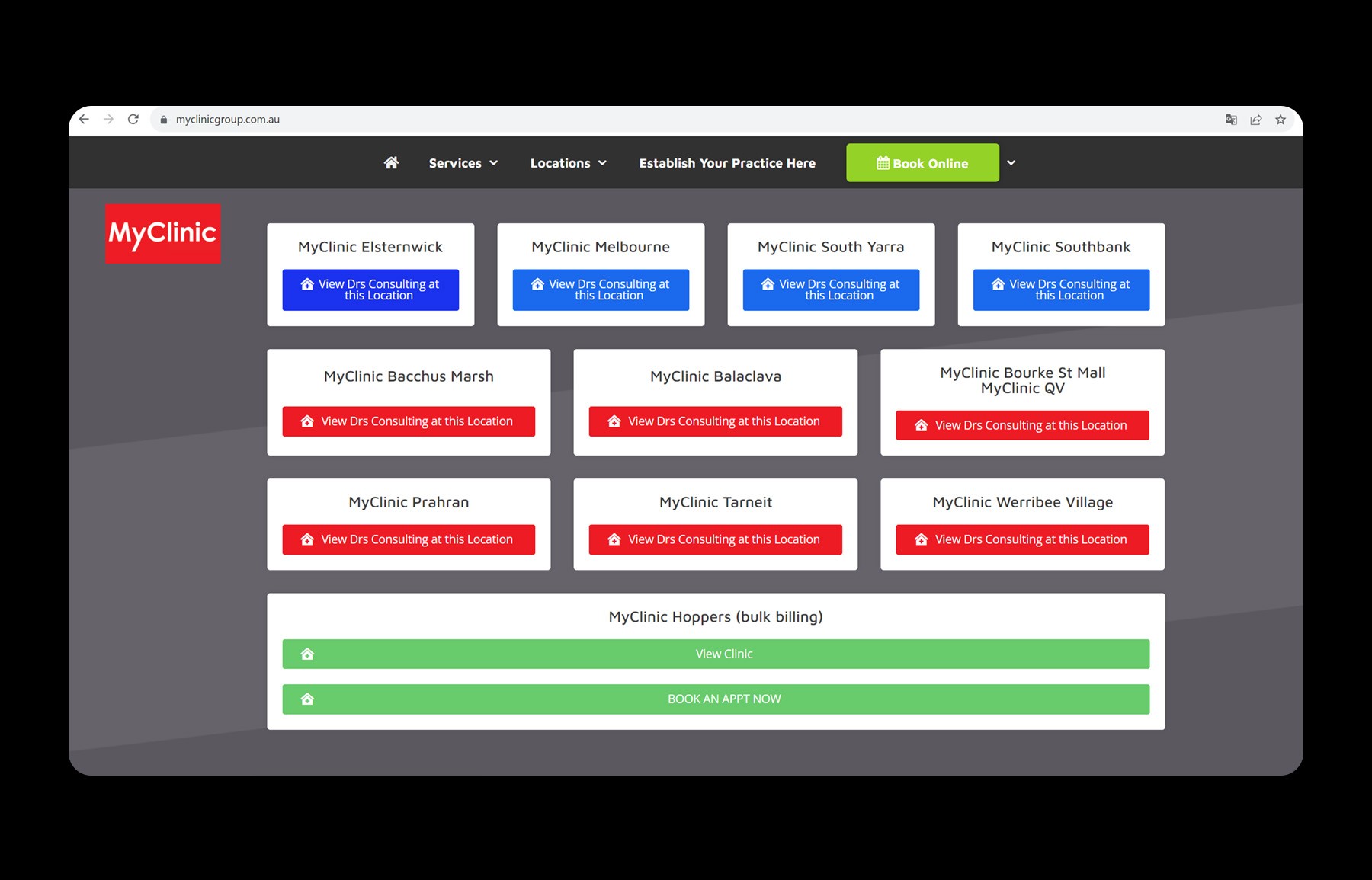
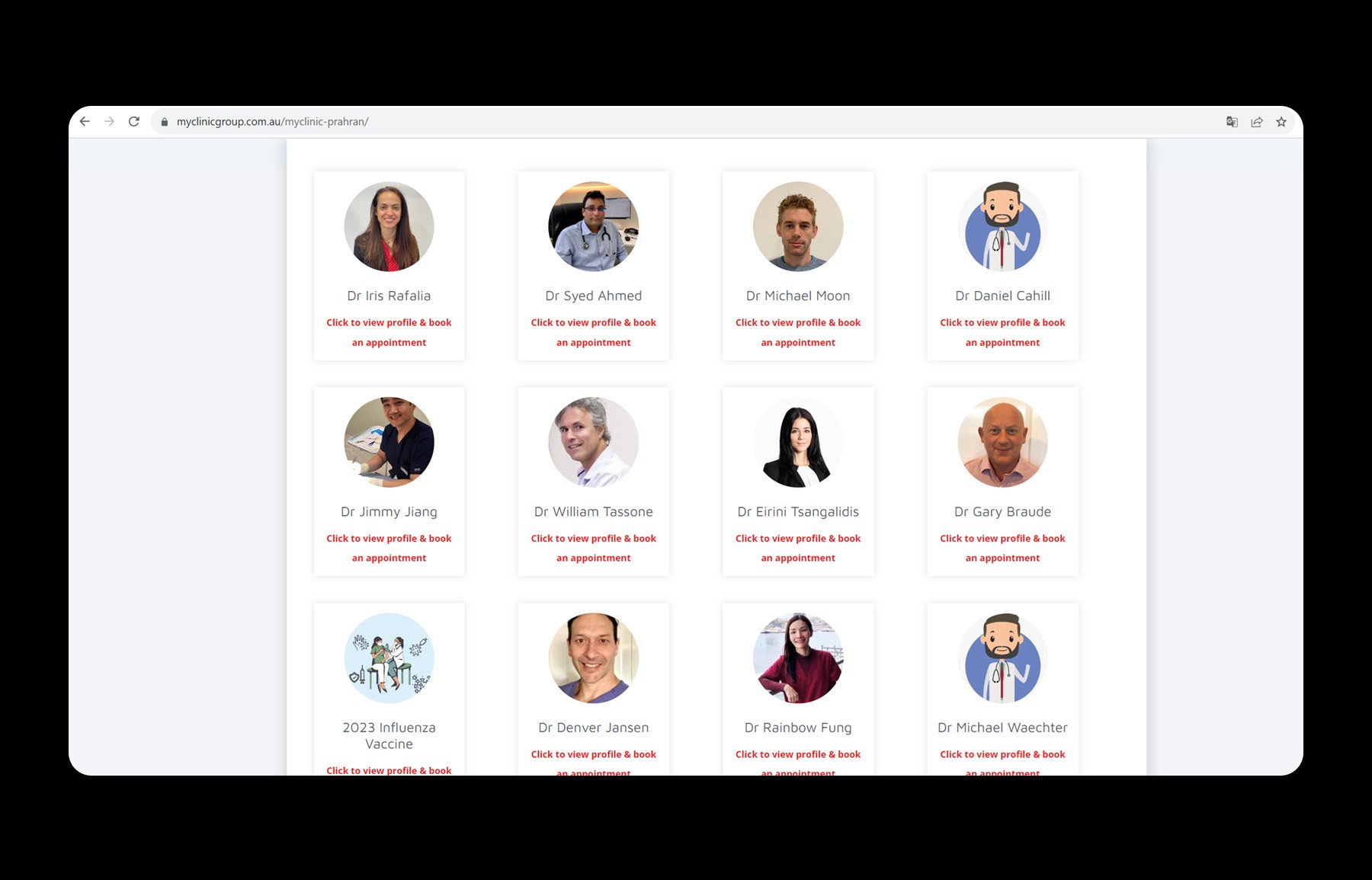
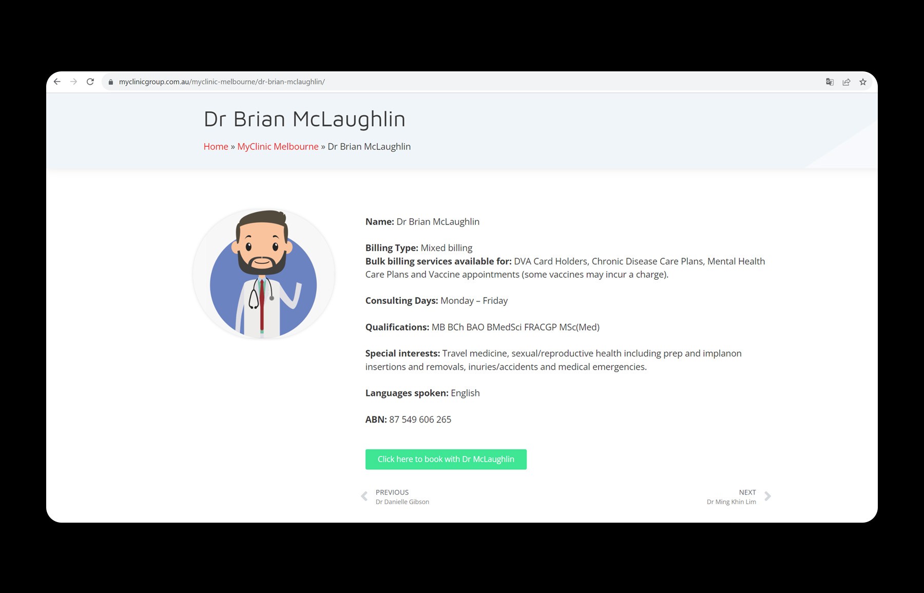
When accessing the site, users encounter severe usability issues at every turn. There is inconsistency in visual identity, failure in standardising images and icons, disorganisation of graphic elements, non-functional features, hidden functionalities, poor use of available screen space, excessive or insufficient information, misaligned text that hampers readability, among other issues.
\\ GOALS
Design an app that significantly enhances the user experience and simplifies the process of scheduling medical appointments. The app's robustness also allows patients to attend consultations via real-time video, making life easier for those in need of urgent medical advice and unable to attend in person.
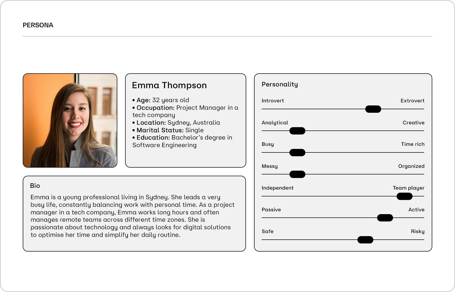
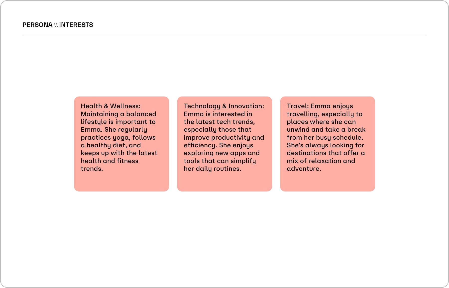
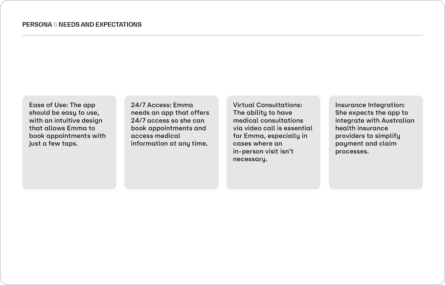
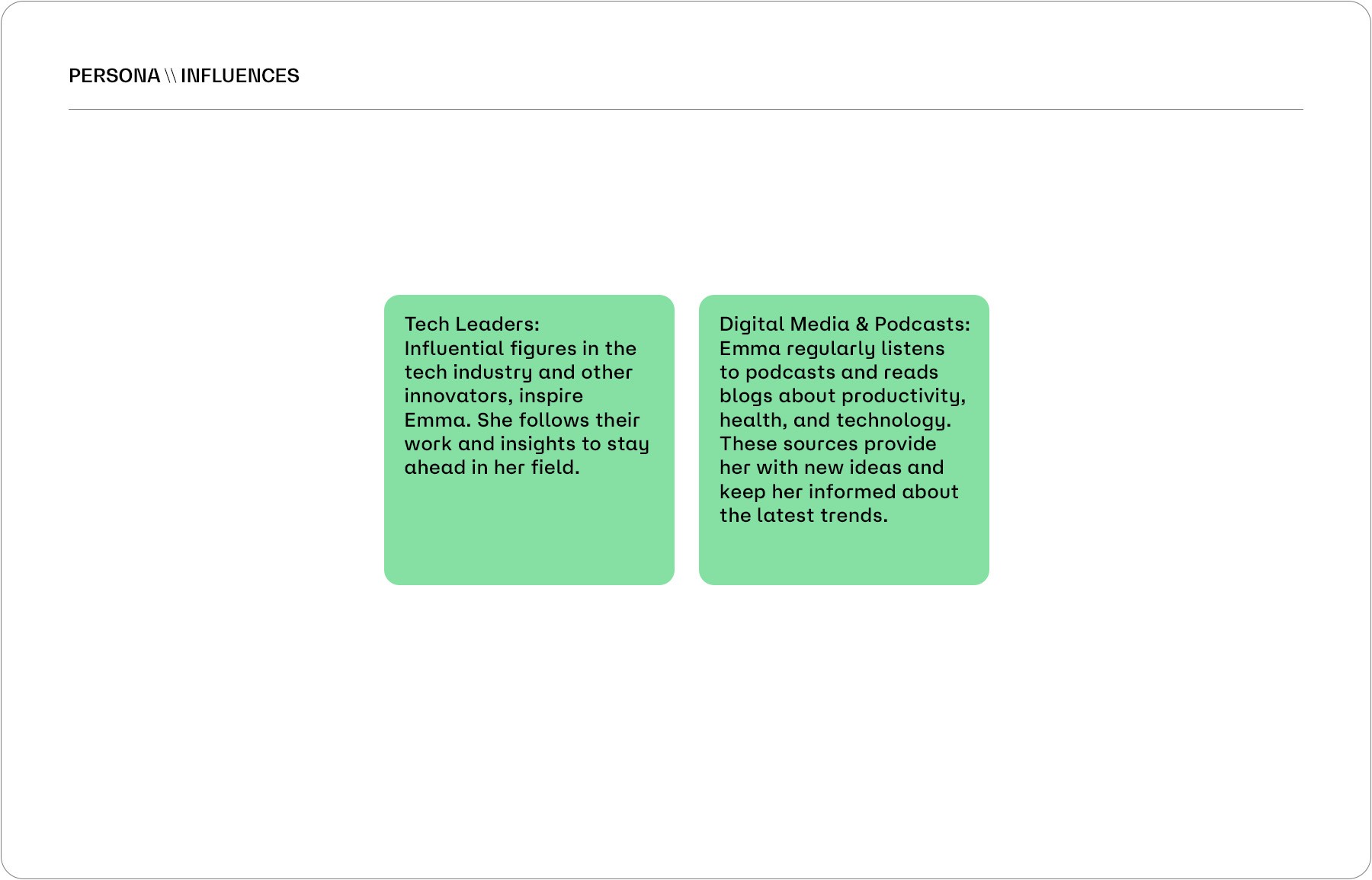
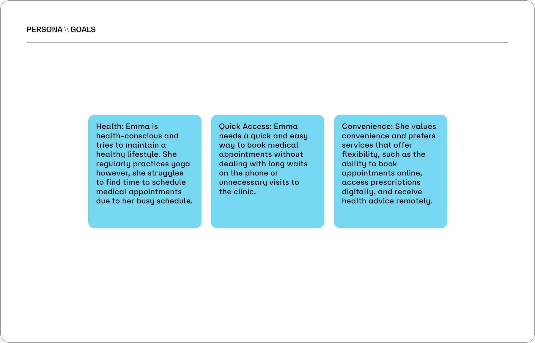
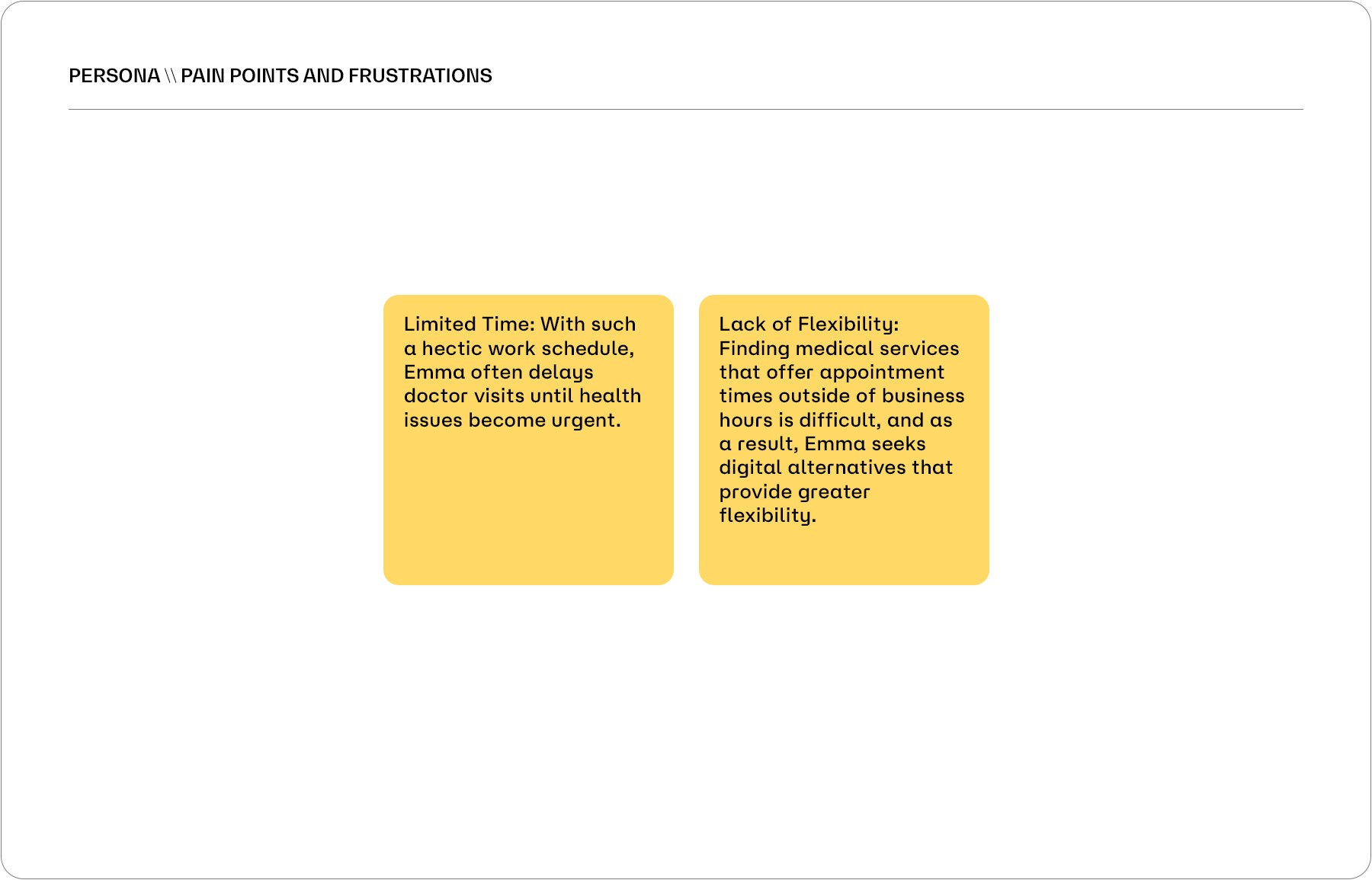
\\ PERSONA
Based on research findings, I created a persona who repersents the target user of the Society and their needs and habits. This helped me to empathize with the end user on the remaining steps of the design process. User frustrations, personal goals, needs, and other attributes were also considered to gather the most comprehensive data and information possible in order to conduct a more complete study.
In this project case study, I will be sharing my experience designing a mobile app for a local medical clinic centre in Melbourne. The goal was to create an app that made it easy for patients to view appointments schedules, locations, and services. Throughout the design process, I focused on creating an intuitive user interface that would enhance the overall user experience and encourage engagement with the brand new app.
\\ PROBLEM
When accessing the site, users encounter severe usability issues at every turn. There is inconsistency in visual identity, failure in standardising images and icons, disorganisation of graphic elements, non-functional features, hidden functionalities, poor use of available screen space, excessive or insufficient information, misaligned text that hampers readability, among other issues.
\\ GOALS
Design an app that significantly enhances the user experience and simplifies the process of scheduling medical appointments. The app's robustness also allows patients to attend consultations via real-time video, making life easier for those in need of urgent medical advice and unable to attend in person.
\\ PERSONA
Based on research findings, I created a persona who repersents the target user of the Society and their needs and habits. This helped me to empathize with the end user on the remaining steps of the design process. User frustrations, personal goals, needs, and other attributes were also considered to gather the most comprehensive data and information possible in order to conduct a more complete study.
Services
UX Research
UI Design
Year
2024
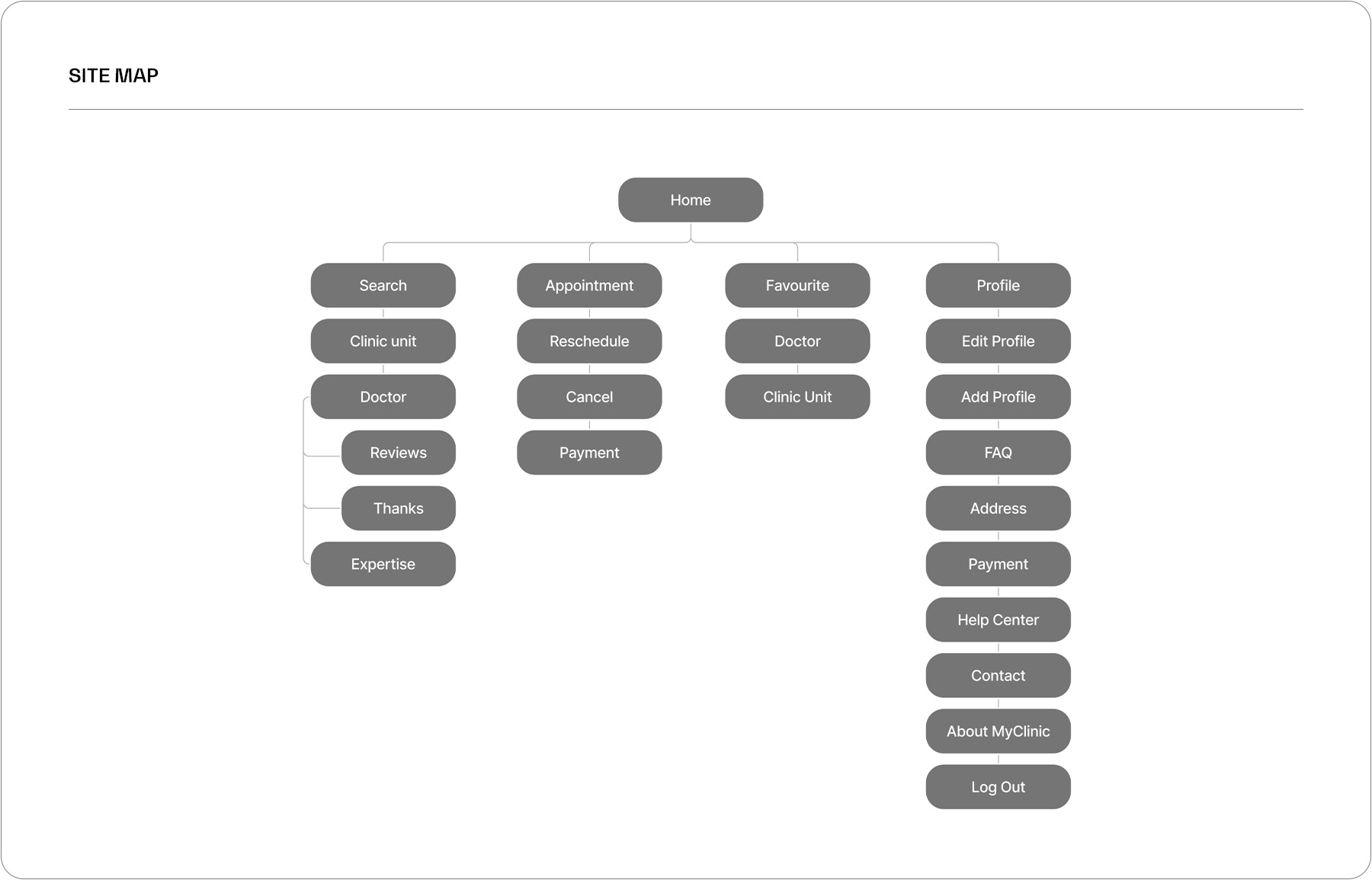
\\ SITE MAP
Based on the research and persona discovery, I brainstormed, compiled and organized the necessary website content and functionality. Pre-redesign, the MyClinic app was heavy in redundant and obsolete information that didn’t provide much substance. I decided to include the most vital and clear information in the app version to make it clean and easy to navigate.
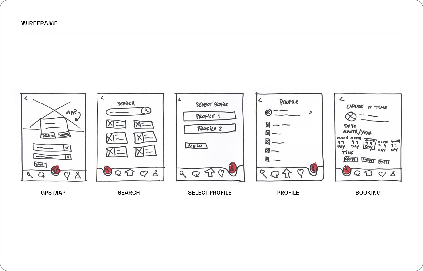
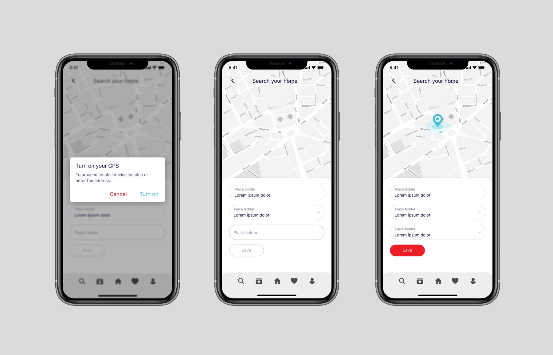
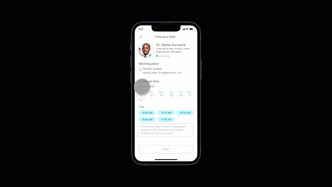
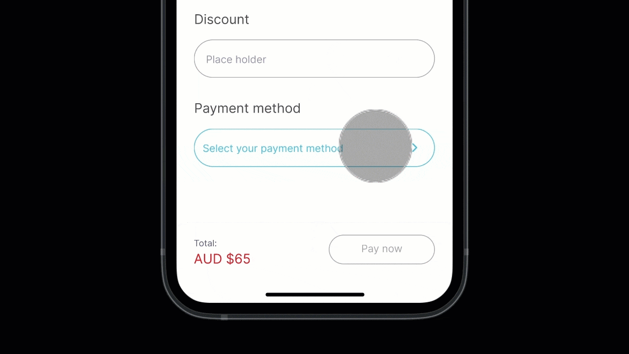
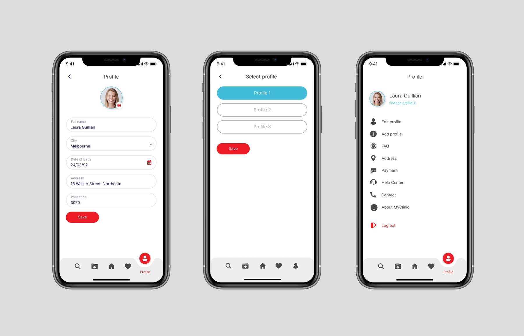
\\ WIREFRAME
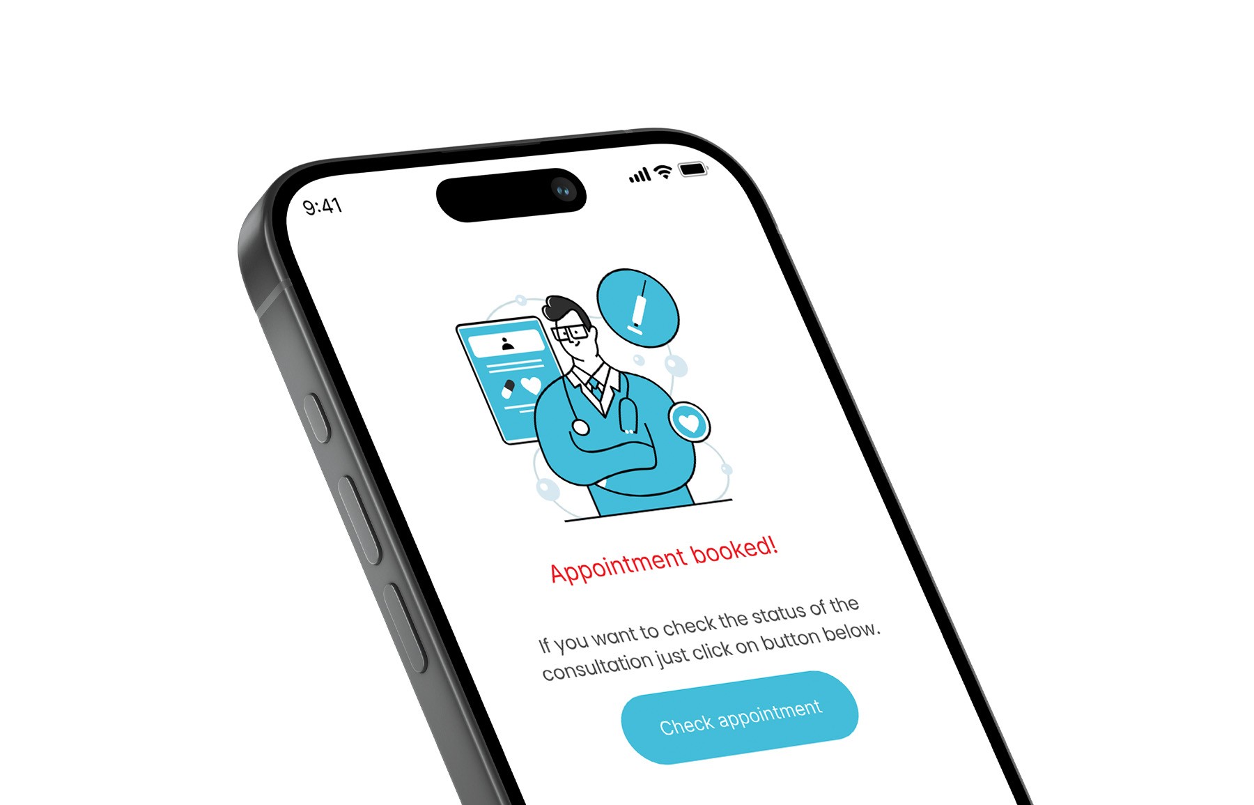
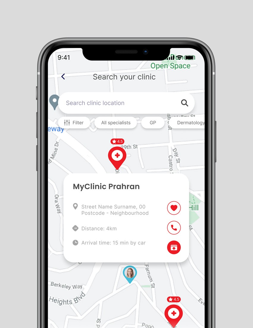
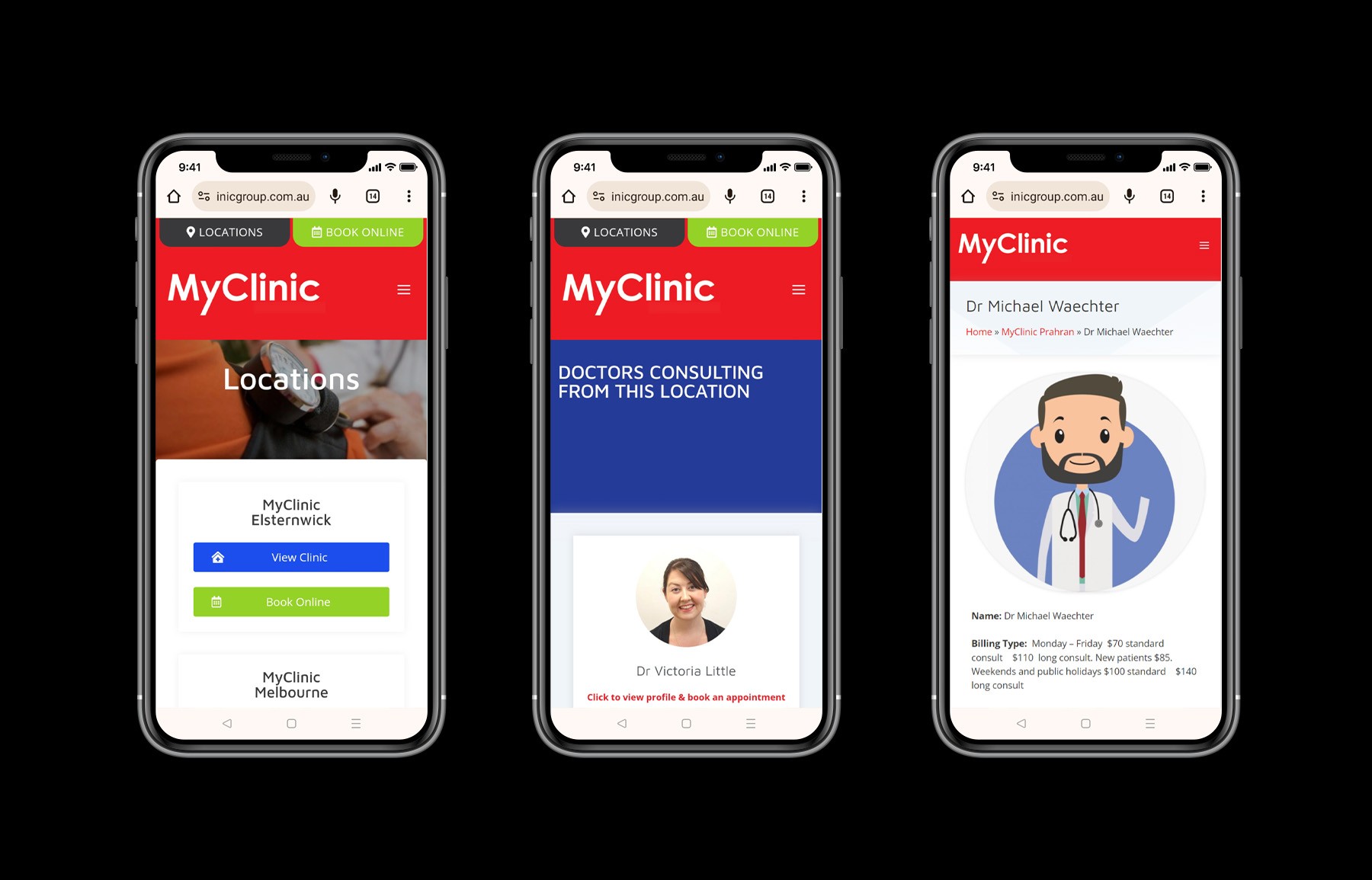
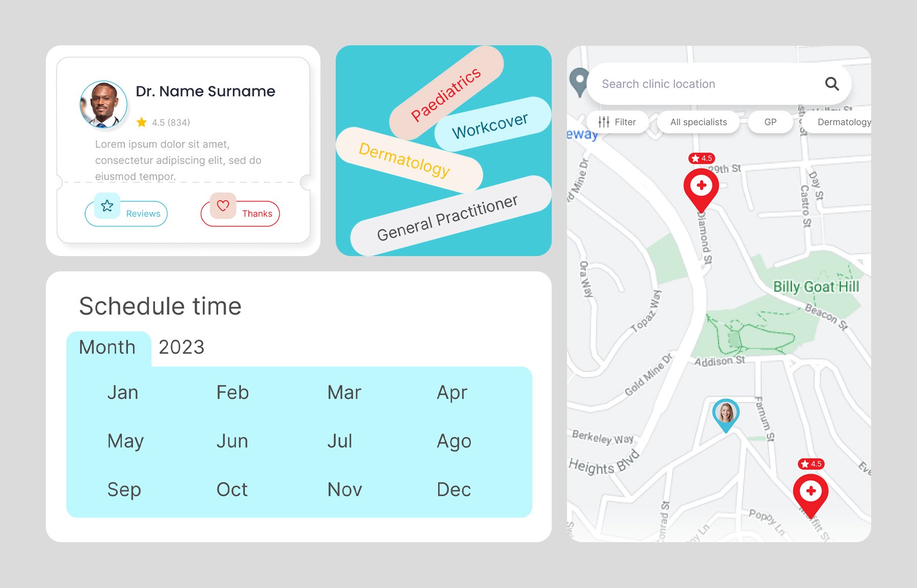
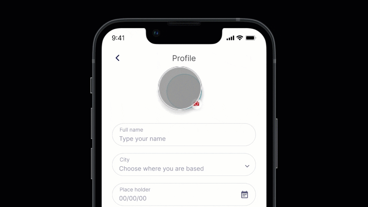
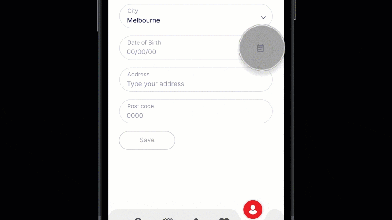
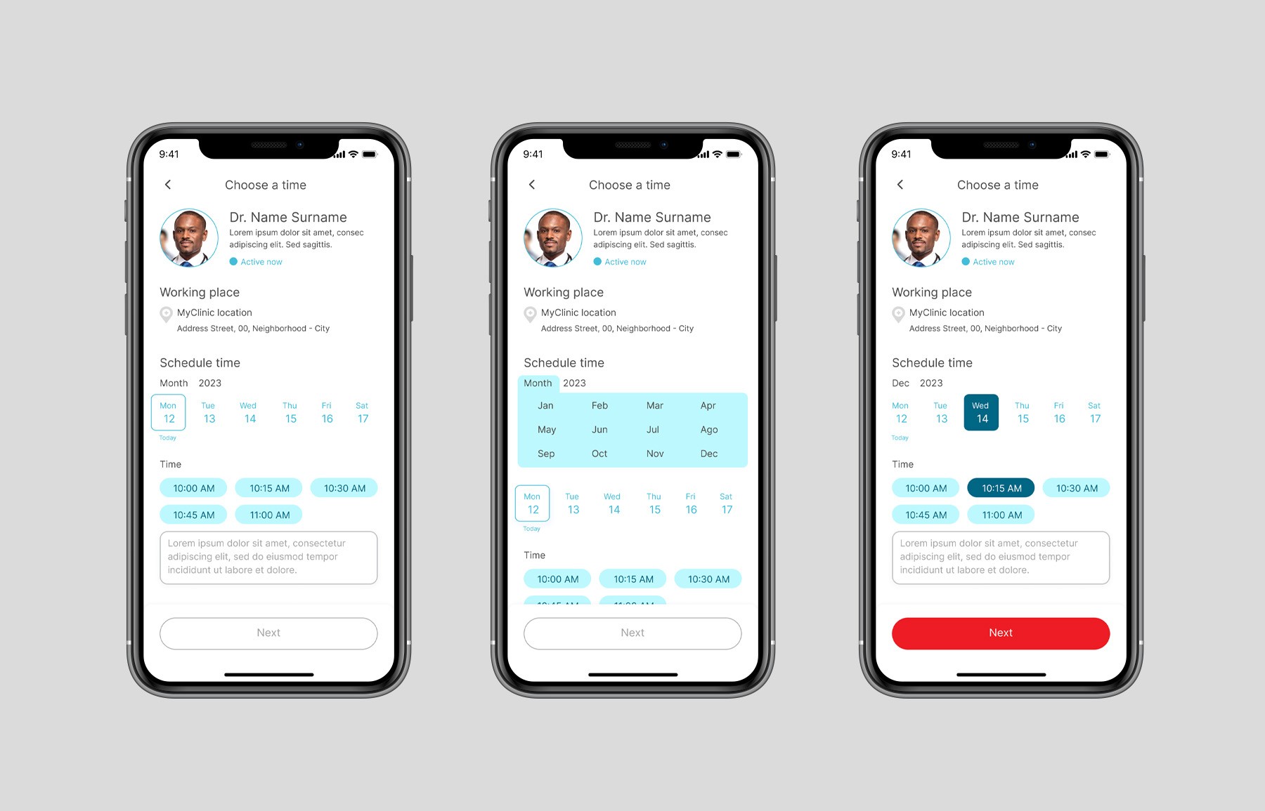
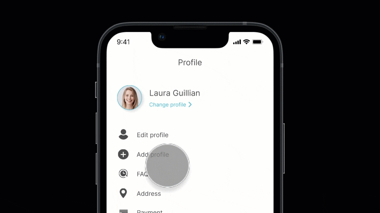
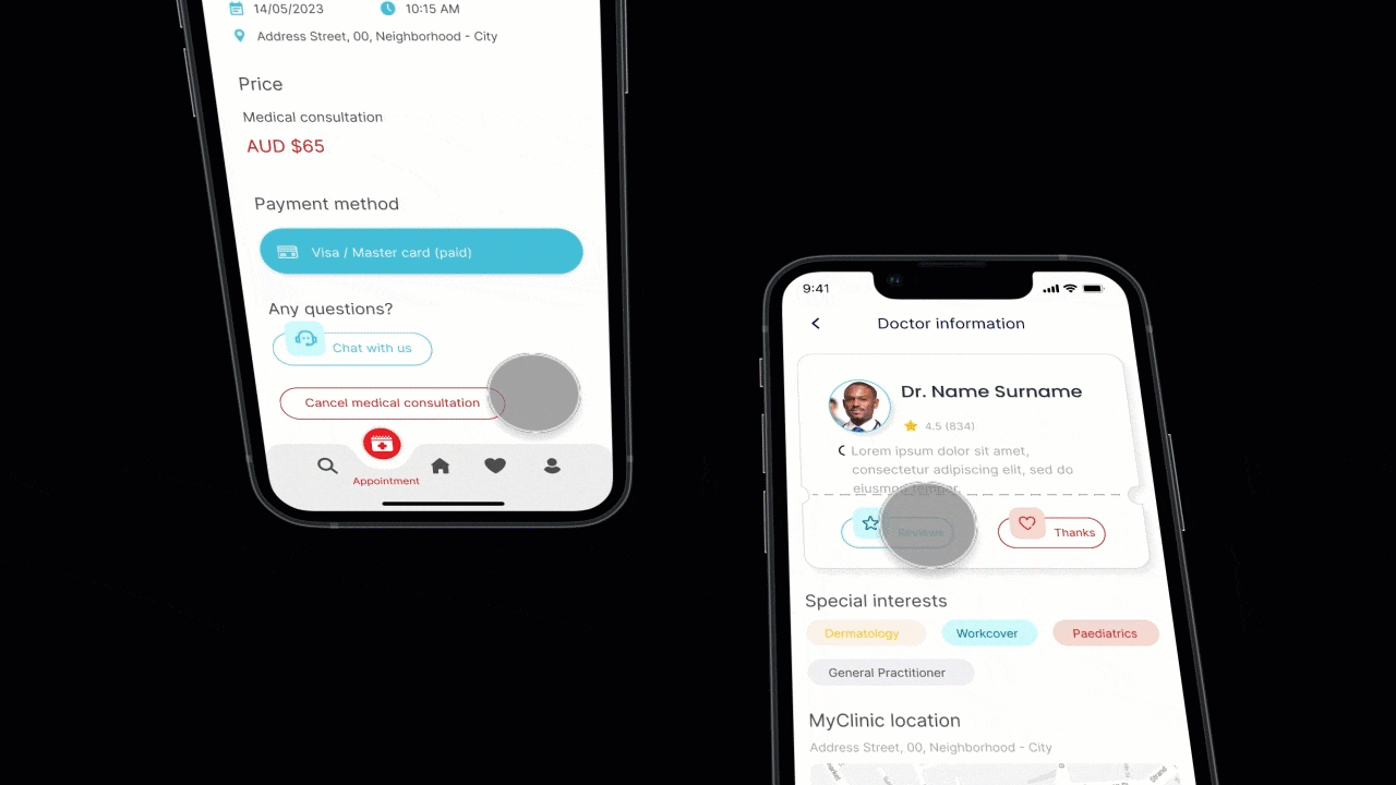
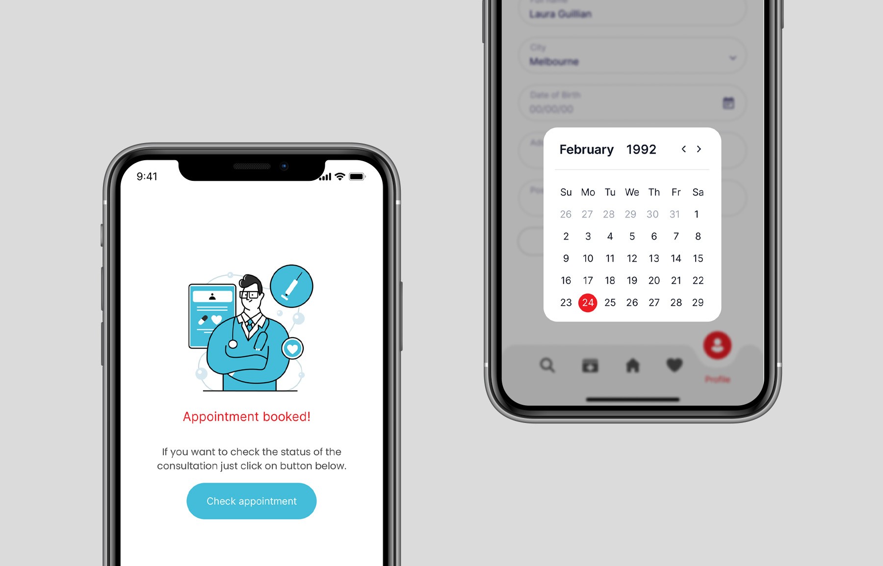
To understand how the system's screens would look and how the elements would be integrated, wireframes were an essential tool throughout the process of conception, development, testing, validation, and implementation. Below are the main screens of the MyClinic app that have been designed.
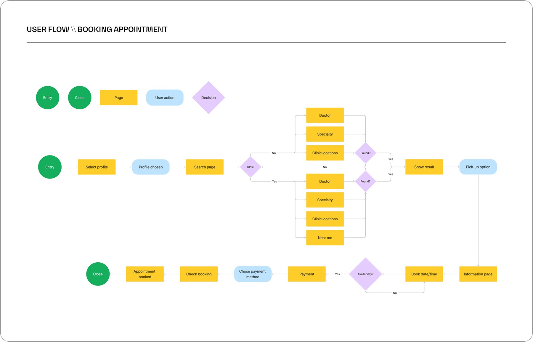
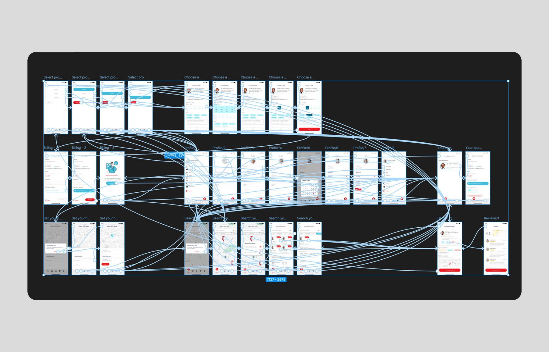
\\ USER FLOW
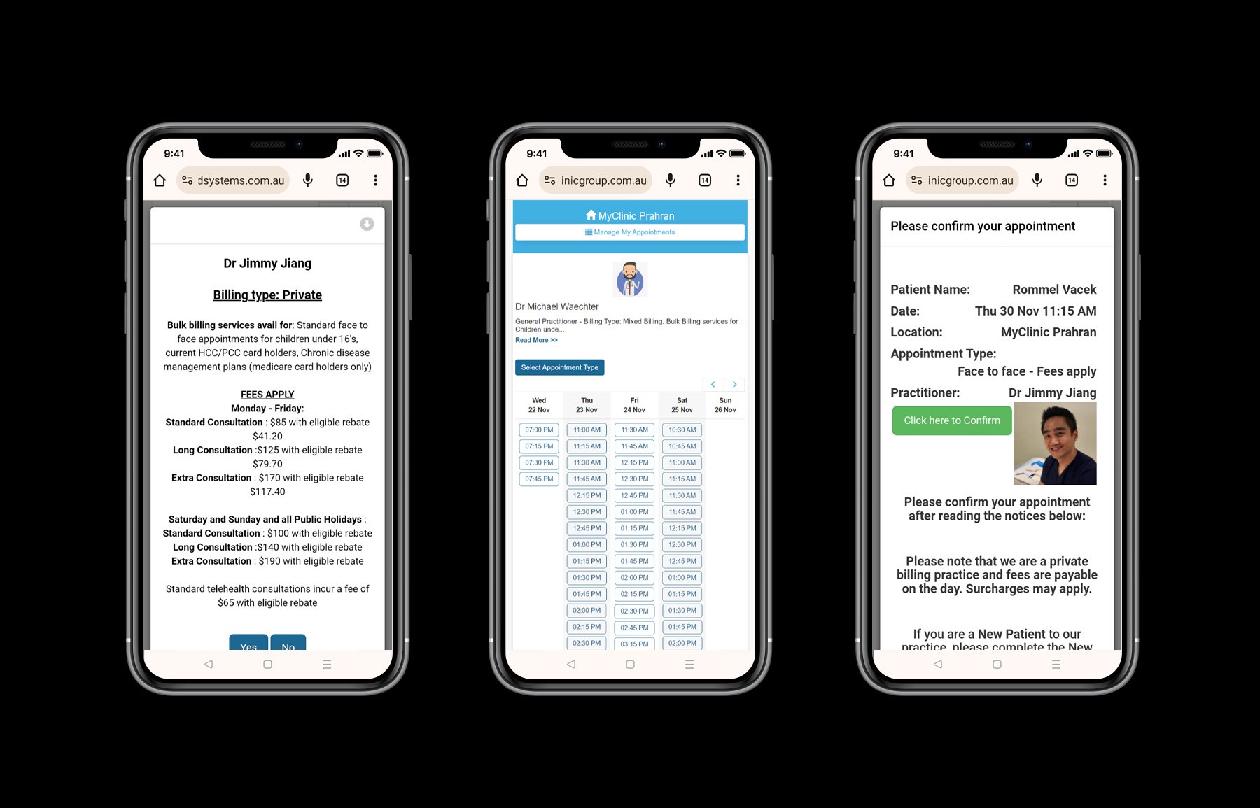
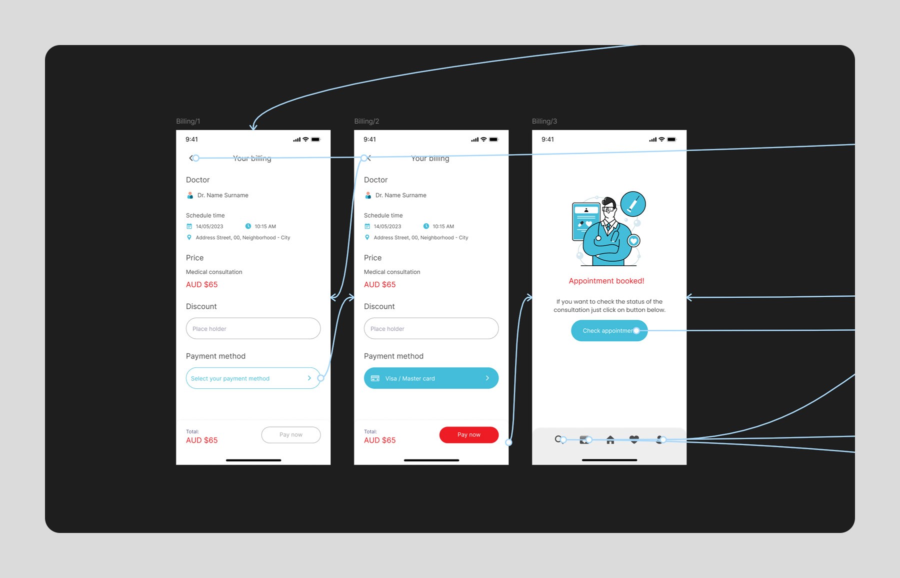
The app offers users several different ways to search while maintaining the same simplicity. Within the app, it's possible to search by the doctor's name, MyClinic's clinic location, the desired specialist type, or proximity via GPS. The latter only works when the GPS tool is activated, and the map within the app can be further explored by the user. Despite this specific functionality, the rest of the appointment booking process is straightforward and simple, preventing users from getting confused and giving up before completing the process.
\\ OUTCOME
The final outcome of the project app was a user-friendly and engaging digital product that exceeded the client’s expectations. Users were able to easily booking medical appointments, visualize prescriptions, records, and get in touch with the MyClinic, all within a seamless and intuitive app experience.
As a result, the educational centre saw an increase in user engagement and loyalty, and the app has become an important part of their overall customer experience.
\\ SITE MAP
Based on the research and persona discovery, I brainstormed, compiled and organized the necessary website content and functionality. Pre-redesign, the MyClinic app was heavy in redundant and obsolete information that didn’t provide much substance. I decided to include the most vital and clear information in the app version to make it clean and easy to navigate.
\\ WIREFRAME
To understand how the system's screens would look and how the elements would be integrated, wireframes were an essential tool throughout the process of conception, development, testing, validation, and implementation. Below are the main screens of the MyClinic app that have been designed.
\\ USER FLOW
The app offers users several different ways to search while maintaining the same simplicity. Within the app, it's possible to search by the doctor's name, MyClinic's clinic location, the desired specialist type, or proximity via GPS. The latter only works when the GPS tool is activated, and the map within the app can be further explored by the user. Despite this specific functionality, the rest of the appointment booking process is straightforward and simple, preventing users from getting confused and giving up before completing the process.
\\ OUTCOME
The final outcome of the project app was a user-friendly and engaging digital product that exceeded the client’s expectations. Users were able to easily booking medical appointments, visualize prescriptions, records, and get in touch with the MyClinic, all within a seamless and intuitive app experience.
As a result, the educational centre saw an increase in user engagement and loyalty, and the app has become an important part of their overall customer experience.

Credits
Creative Direction
Dave Johannson
Maya Lunda
Creative Direction
Dave Johannson
Maya Lunda
Creative Direction
Dave Johannson
Maya Lunda
Motion Design
James Weider
Motion Design
James Weider
Motion Design
James Weider
Design
Mike Smith
Design
Mike Smith
Design
Mike Smith